
Our Latest Design
We're excited to unveil our latest project:
a new logo, and a completely redesigned website.
A rebrand isn't something we took lightly, and it's not something we outsourced and forgot about. Over the past several months, our team sat down together to ask a simple but important question: does our brand still reflect who we are? As Sandbar Architecture has grown, our visual identity needed to catch up with the range and ambition of the work we do. What started as informal conversations turned into a full internal design sprint, with input from the entire firm.
Everyone at Sandbar Architecture had a voice in shaping the new identity, from early concept reviews to picking the final color palette. That collaborative spirit is fitting, because it's the same way we approach every project we design: as a team, with every voice at the table. The result is a brand that feels less like a marketing exercise and more like an honest reflection of how we actually work.
Our old mark leaned on hard geometry. A compass-like circle framing a triangular peak, rendered in a cool, corporate blue. It was clean and technical, but it didn't quite capture the spirit behind our name.

Sandbars aren't rigid; they're formed by movement, by water shaping the sand over time, by the push and pull of tide and current.
The new Sandbar
A new identity, same passion for thoughtful design.
Our new mark takes its cue directly from the landform we're named for: a single, continuous line that rises, dips, and curls back on itself, echoing the way a sandbar naturally forms as water and current shape the land over time.
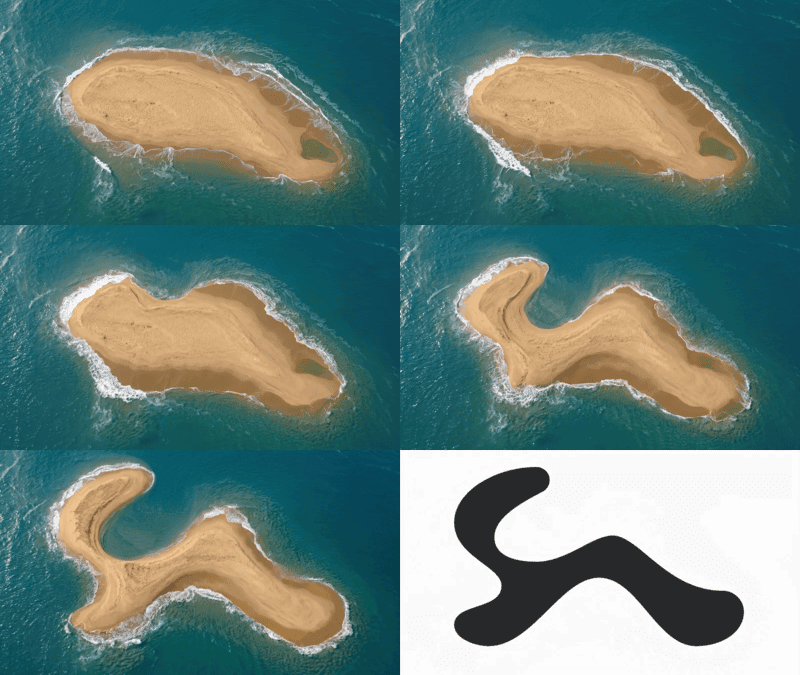
Look closely, and you'll find our initials woven into the form: the curl of the 'S' and the peak of the 'A,' quietly built into the form rather than spelled out.
Blueprint for our
New Logo
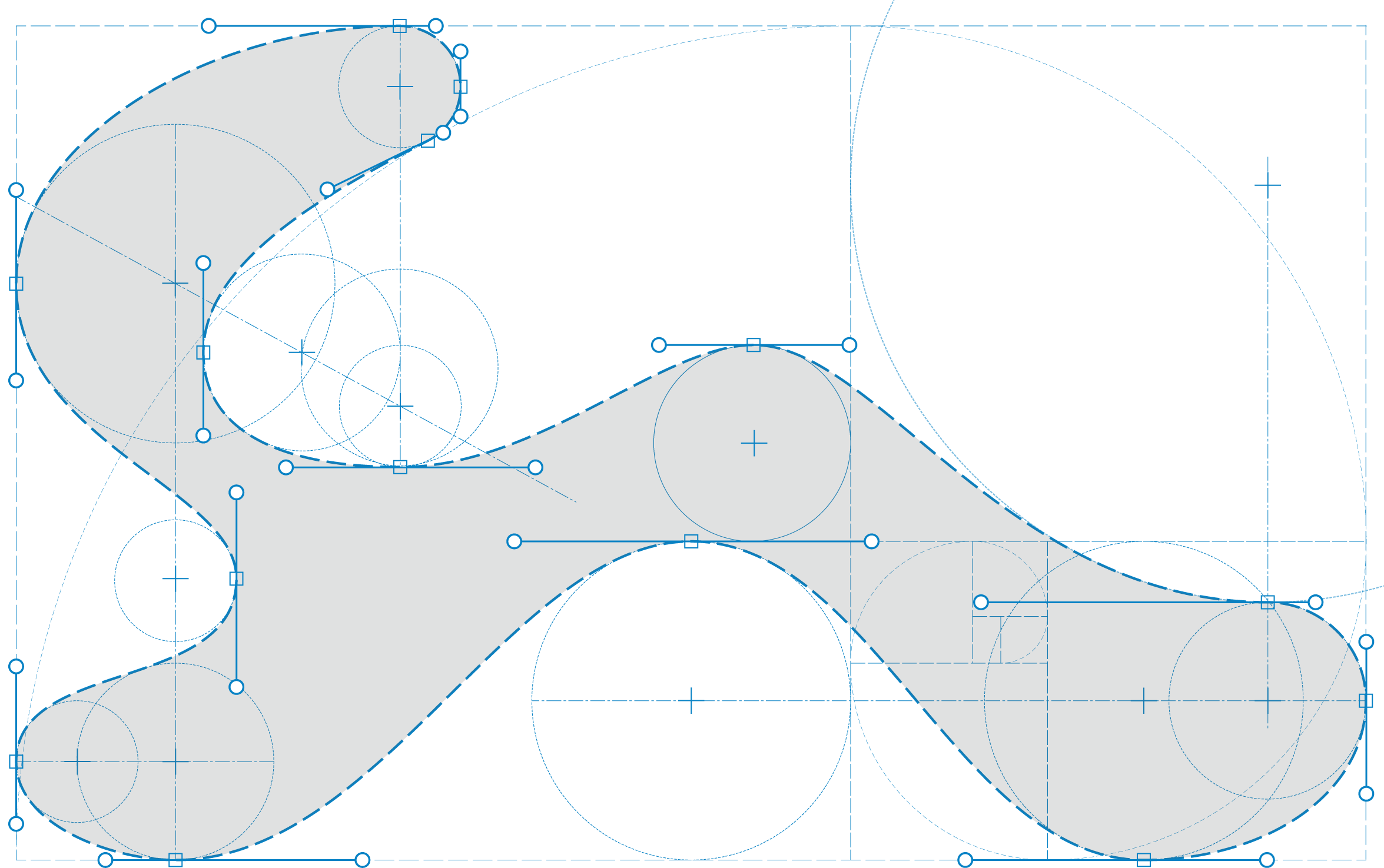
The logo you see is the outcome of dozens of small, deliberate decisions, refined until every line felt inevitable. Every curve was drawn using circles, tangent points, and intersecting reference lines to define the intricate curves. It is that same disciplined, iterative process we use for all our projects.
New Voice,
Same Name
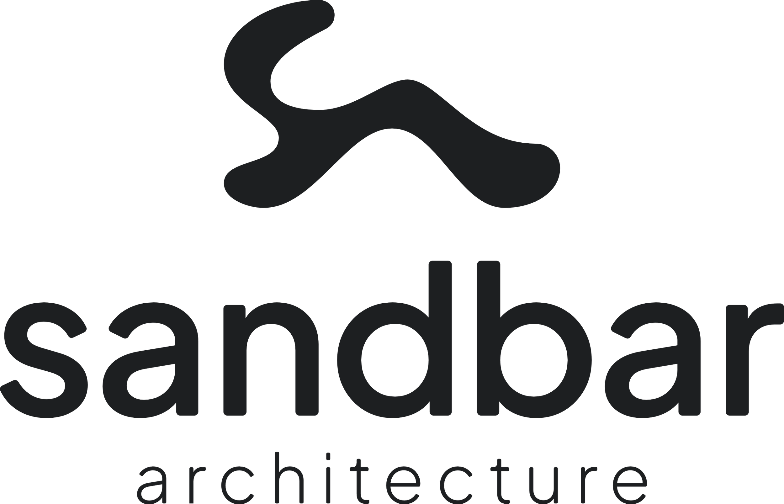
We also rethought our typography. The old wordmark was all capital letters. Clean, but formal. The new wordmark pairs a bold, lowercase "sandbar" with a lighter, more understated "architecture" beneath it, the lowercase letters echoing the organic nature of the logomark.
Come See
What's New
Along with the new look comes a brand-new website, built to better showcase our work and make it easier to connect with our team. You'll find an updated portfolio featuring recent projects across religious, educational, commercial, and aviation work, along with a clearer look at our services and design process. We wanted the site to feel as considered as the buildings we design, so every page was built with the same attention to detail.
Take a look around, and let us know what you think.